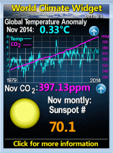
Check out the new widgets I've added on the right-hand sidebar:
Anthony Watts of Watts Up With That (aka WUWT) provides the World Climate Widget. For a full explanation of what you see in this widget, click here. This widget may change somewhat as Anthony is still working on it. But do notice that the steadily rising purple line is CO2 concentration while the jagged waveform is temperature. The graph goes back to 1979. Notice what the temperature trend is doing. Now why should we believe that CO2 concentrations are driving temperature?
I find the Commodities and Crude Oil Price widgets and the Currency Exchange widget useful from time to time so here they are in one place.
Also, sandwiched in there you'll find a link to Newfoundland and Labrador's government regulated prices for gasoline, diesel and home heating fuel. There's no widget, just a link, and the tables are in PDF (ugh). For my local readers, using the Crude Oil graph and the government link together might help you predict when to fill up and possibly save a few dollars.
If you find these widgets useful or you have a suggestion for other useful tools, let me know by email or drop it in the comments. (Didn't know I allow comments? Just click on any headline!)
Thursday, October 22, 2009
Subscribe to:
Post Comments (Atom)


 Canadian Dollar Converter


No comments:
Post a Comment
Comments are welcome. I prefer you didn't post anonymously.
To keep it civil, comments are moderated. I reserve the right to decide what appears on my blog.